How to Use Font in Powerpoint Design
This chapter is from the book
Defining Theme Fonts
Theme fonts include two settings, one for headings and another for body. The Heading font applies to all Title placeholders and the Body font applies to all other text, including all other placeholders and default text in charts, tables, SmartArt, and individual textboxes. This helps establish a consistent look for text throughout a presentation. You can choose from the built-in theme font sets or create a custom font set.
Selecting from Built-In Theme Fonts
When you're setting up a template or theme and deciding what fonts to use, the built-in font sets are a good place to start. To choose one of them, follow these steps:
-
Open a blank presentation or continue with the presentation from the previous exercise in which you defined custom theme colors.
-
From the Design tab, select Fonts. In this gallery, you can choose from any of the built-in font sets, as shown in Figure 3.18.
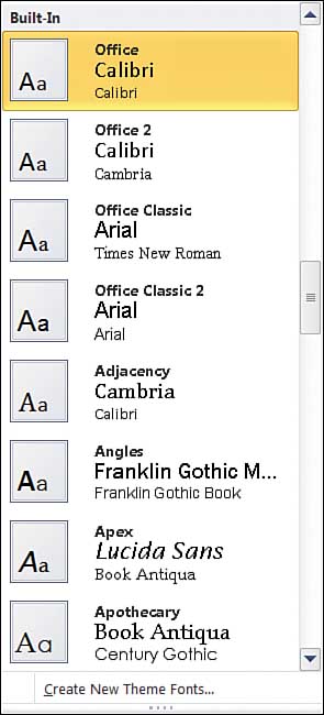
Figure 3.18. The Built-In Theme Fonts gallery offers many choices for sets of theme fonts. As you scroll through the list, hover on a theme name to see a preview of the fonts on your current slide.
-
Scroll down the list and hover over different theme names; your slide text will dynamically change to show you a live preview of the theme fonts.
-
Click on a theme font set to apply it to the current file.
Creating Custom Theme Fonts
To create a custom theme font set, do the following:
-
From the Design tab, select Fonts, then Create New Theme Fonts.
-
Select a Heading font.
-
Select a Body font.
-
Type in a name for your theme font set.
-
Click Save.
You can select the same font for both Heading and Body. Many of the built-in font themes are set up this way.
When you save new theme fonts to your system, you see the new name listed in the Custom section of the Fonts gallery as pictured in Figure 3.20. This will not be the case for other users. Although the settings for theme fonts do travel with a template or theme file, other users cannot see the theme font set listed in their Fonts galleries.
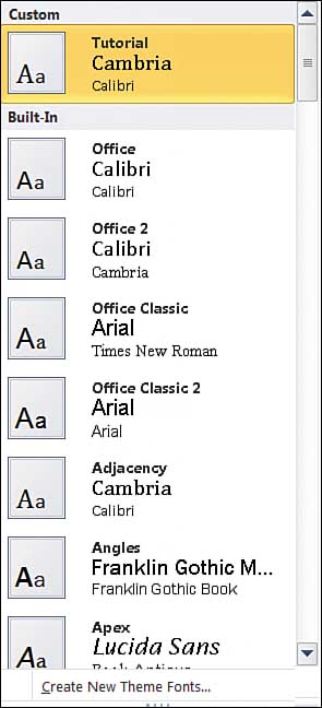
Figure 3.20. The new Tutorial theme in the Custom section of the Fonts gallery.
Sometimes you need to change the Heading or Body font, or both. Instead of creating a new set of theme fonts each time you make a change, you can edit the existing file. In the Fonts gallery, right-click the current theme font set's name and choose Edit. Make your changes and save the file, retaining the original name.
Choosing the Right Fonts
Just like the decisions you make for theme colors, the choices you make for fonts will have a lot of impact down the line. Theme fonts will populate all placeholders and default text and appear in (just about) every future slide created with the template.
One thing to consider when choosing fonts is that the characters in each font have personality and style. Some fonts look more contemporary whereas others can appear dated or retro. The fonts with the most personality are referred to as ornamental or display fonts. They have more distinctive letterforms and are not well-suited for body fonts (Chiller, Juice ITC, or Mistral are examples).
Legibility is the most important visual characteristic for a presentation font. You should choose fonts that are simple in design and form so that the letterforms are distinguishable at smaller sizes (consider chart labels or table data, for instance). This is why most presentation professionals suggest using sans serif fonts. Serifs refer to the small features at the end of letter strokes, as in the classic typefaces Times New Roman or Palatino Linotype. Sans means "without," so sans serif describes letterforms that do not have these extensions. See Figure 3.21 for some examples of sans serif fonts.
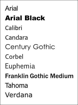
Figure 3.21. Sans serif fonts are the best choices for body fonts. This list includes just a few examples.
Some serif fonts work well for larger text sizes and are completely appropriate choices for Heading fonts. (Figure 3.22 shows some examples of serif fonts.) So, why not use them for body text? Serif characters are generally formed with thick and thin strokes. At small sizes, the thin strokes can break up or disappear, which makes reading text difficult. Think about chart labels as a baseline for smaller font sizes. You want to ensure that even the smallest text is clearly legible.
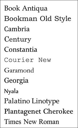
Figure 3.22. This list features a few serif fonts, which look best at larger text sizes.
As stated earlier in the chapter, when selecting fonts you must consider everyone who will be using that template to create, edit, or display presentations based on that template. The theme fonts must be present on a user's system for the template to work properly. If the template (and subsequent presentations) will be shared among many users, you must stick with fonts that are common to all.
Consider the following scenarios to help you determine which fonts to choose for your theme.
Scenario 1: Creating a Single-Use Template
In this situation, you're designing and building a template on the computer that will display all presentations created with that template. Perhaps the presentations will only be printed, converted to PDF, or output to video from this system. (If there is any chance the presentation will be shared elsewhere, see Scenario 3.)
In this case, the sky's (almost) the limit. You can select any font from your Fonts gallery within PowerPoint, including fonts that your company has purchased licenses for. (Hello, branding fonts!)
Many fonts are installed with Microsoft Windows and Microsoft Office. Figure 3.23 includes a sample list of fonts that might be installed with specific versions of these programs.
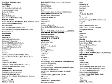
Figure 3.23. A sample list of fonts installed with Microsoft Windows Vista and Windows 7, Microsoft Office 2007 (Small Business, Professional, Ultimate, Professional Plus, Enterprise versions) and Microsoft Office 2010 (Standard, Professional, Professional Plus versions).
Scenario 2: Creating a Template for Use in a Small Group
Let's say you work for a small company. You know for a fact that everyone in the company has the same computer setup: the same operating system and same version of Microsoft Office. When creating templates for an ideal (and surprisingly uncommon!) situation like this, you might choose from any of the fonts that appear in your PowerPoint font list.
Remember though: If presentations are shared beyond this small group of users, you run the risk of font substitution for those who have a different computer setup from the original group. Don't forget, this includes your clients, your vendors, and anyone else to whom you might send the presentation.
In this scenario, planning ahead for the inevitable shared presentation is best. Make sure any fonts that you're using can be embedded with the presentation. You must test this thoroughly! PowerPoint won't always warn you when a font cannot be embedded. Also be aware that, because most embedded fonts will not travel with a template, everyone at your company must know how to embed fonts when saving a presentation and remember to do so!
Scenario 3: Creating a Template for a Large Group of Users
In this most-common situation, it's better to be safe (and boring) than sorry. With little information about end users' systems, sticking with fonts from the list shown in Figure 3.24 is the best option. These fonts are common to most users.
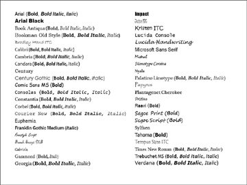
Figure 3.24. When creating a template for a large group of users, choosing from this list of fonts that are common to most users is best.
To make your font decisions easier (or for you designers, utterly frustrating), the choices from this list of 45 common fonts are further limited by character legibility and font style. As discussed in the first part of this section, sans serif fonts are preferable for presentations. You can eliminate many of the display fonts such as Freestyle Script, French Script MT, Juice ITC, Mistral, Papyrus, and so on because they're impractical choices for templates. The characters do not scale well, which makes reading text at smaller sizes difficult. There's always an exception to the rule, so you could make a case for choosing one of the display fonts as the Heading font.
Purchased Fonts and Embedding
Although we would all love to use unique fonts for presentation templates, the reality is that this proposition is risky in regard to PowerPoint. Here are a few things to consider regarding embedding purchased or free fonts:
-
As mentioned earlier, most fonts cannot be embedded in a template and theme files do not support embedding. Theme fonts must be installed in order for anyone to use these files.
-
Your company might have purchased the rights to use certain fonts for all company documents and presentations. The fonts work just fine on employees' systems. But typical font licensing does not extend beyond internal company usage (distributing the fonts to anyone outside your company is illegal). This means that anyone outside the company (such as ad agencies, marketing firms, event companies, and so on) must purchase a licensed copy of the fonts. If theme fonts cannot be embedded or distributed, PowerPoint makes substitutions for them, often with disastrous results.
-
Many sites offer free fonts; most of which are display or decorative fonts and unsuitable for body text. Be aware that many of these fonts have incomplete character sets, which means you might not have all the symbols you need. Also, some free fonts can overwrite legitimate fonts on your system if the filenames are the same.
-
Many fonts cannot be embedded at all, and those that can might have license restrictions that limit embedding to print and preview purposes only. Most type foundries do not allow editable embedding of their fonts, and do not offer licenses for fonts that will embed with a template. Adobe OpenType fonts are not embeddable in any Office program (these fonts have an .OTF extension). Only TrueType fonts (.TTF extension) can be embedded, but even then, not all TrueType fonts are embeddable. You must test the font embedding capabilities to be sure.
-
PowerPoint might not warn you that a font is not embeddable. When you save a presentation, it might look like fonts are embedding. You must test the file by opening it on a system that does not have the fonts installed. You might discover the fonts have been replaced instead of embedded.
-
Even if the fonts are embeddable (and tested), can you be sure that all employees will know how to embed fonts and remember to do so?
-
Embedded fonts increase the presentation file size.
-
Mac versions of PowerPoint cannot use fonts that have been embedded. Because the newest versions of PowerPoint for Mac and PC are very similar, you should consider that your presentations might be viewed on a Mac system.
-
If your company has a large budget, you could purchase custom-built, open-licensed fonts to embed in your templates. This is an expensive proposition and requires thorough testing to ensure the embedded fonts work on other systems. Remember though, Mac versions of PowerPoint cannot use embedded fonts at all.
Think carefully and test thoroughly before choosing uncommon or licensed fonts for corporate templates. The purpose of a template is to establish basic design parameters that help to maintain some consistency among a group of users creating presentations. Not enough control exists over font embedding and font substitution to outweigh the risks when distributing a template to a large number of people.
For more details about embedding fonts with PowerPoint, visit the PPTFAQ at http://www.pptfaq.com/FAQ00076_Embedding_fonts.htm.
How to Use Font in Powerpoint Design
Source: https://www.informit.com/articles/article.aspx?p=1960223&seqNum=2
0 Response to "How to Use Font in Powerpoint Design"
Mag-post ng isang Komento